

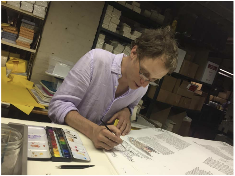
George wanted to create a new edition that recalled many of the things that were visible in the time of Dante: every move the artist made was a careful choice.
Ancient Pigments From the Time of Dante
To truly see the Divine Comedy through Dante’s eyes, George seeks to create a visual experience through color that transports us to the very time of Dante. He does this through the use of ancient pigments and inks made in Florence, Italy, that were used by medieval and Renaissance artists.
I wanted to create a new edition that recalled many of the things that were visible in the time of Dante.
George Cochrane
Interested in the whole story of how “La Divina Commedia – The New Manuscript” came to be? Check the index of articles here.
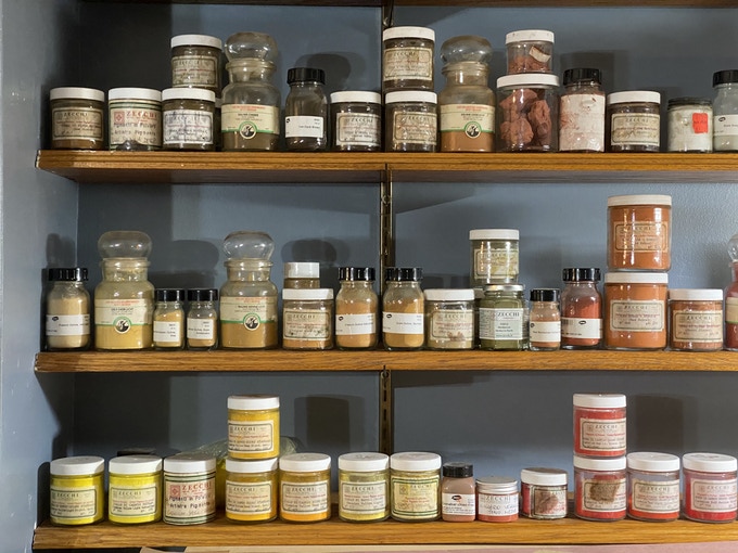
To start building his Color Library, George went to the source: Zecchi, in Florence, Italy.
Zecchi is more than just an art supply store. Major Florentine works of art, as well as some of the most important international masterpieces of art – have been restored with the help of Zecchi’s products. They source the finest pigments from all over the world, including colors native to Italy.
The Colors
One very special color is verdaccio, a hand-mixed combination of Naples Yellow and Raw Umber used for skin-tone shading since before the Renaissance. This color, following ancient formulae, is made only by Zecchi and appears in all of George’s figures.
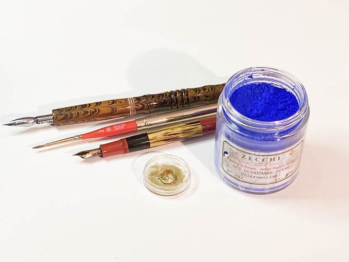
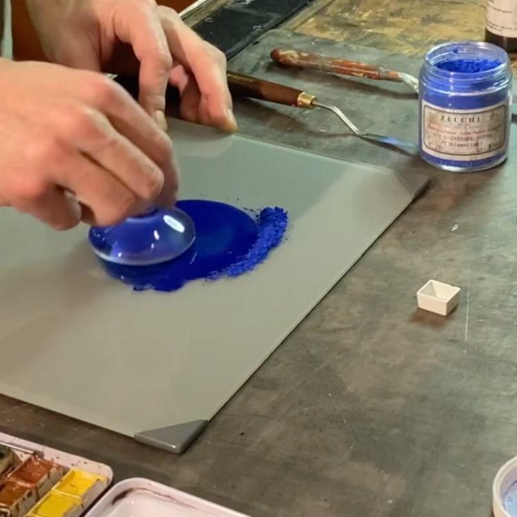
George knew he wanted to use Lapis Lazuli as well. This was an ancient pigment ground from semi-precious Lapis Lazuli stones. It was a color available during the time of Dante and often sought out and reserved for special circumstances. In the case of some exotic colors, such as Lapis Lazuli, Zecchi uses traditional artisanal methods of grinding to achieve the most intense and luminous colors. Florence’s history of working with le pietre dure dates back centuries. Zecchi continues these traditions, and George was able to source this special pigment directly from their shop.
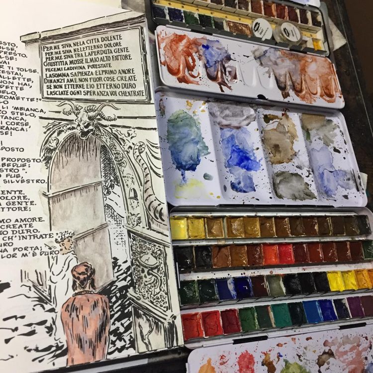
For other ancient colors – George used Sennelier pigments from France and Kremer in Germany to supplement Zecchi’s colors. For instance, he used Yellow Ochre from Morocco, Spain, France, Germany, and Italy, each offering slightly different visual qualities. He also used 24 karat gold from Kremer. The watercolor medium he used includes honey for maximum luminosity.
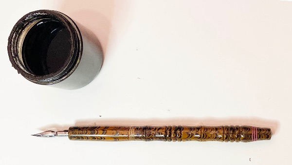
The Inks
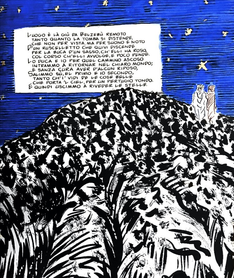
As George thought through his approach to color, he also thought carefully about the inks he would use for the text, versus the inks and colors he would use for the illustrations. Every move George made was a careful choice.
I worked with one ink for the lettering and one for the artwork.
George Cochrane


For the drawings, George developed special requirements for the ink to be used. It needed to have a rapid drying time and be extremely durable when dry. When he erased the pencil drawing below, he had to absolutely make sure there would be no smearing. He also found that he often scratched the ink away to make changes or create certain effects. So, the ink needed to have enough “body” to “sit” on top of the paper for this technique to work. George found that scratching does not work if the ink penetrates the paper too deeply.
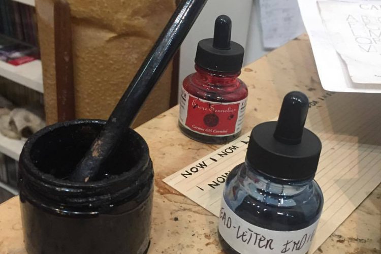
George soon discovered India ink made by Sennelier in Paris.They use an ancient formula that includes shellac (secreted by the female lac beetle) that serves different purposes: hardening the ink, adding extra durability and body, and increasing the luminosity, much the same as oil increases the brilliance of pigments in oil painting.
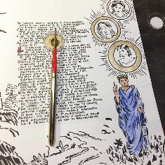
To letter, he used a Pelikan 500 Tortoise Fountain Pen with a fine nib and Noodler’s Black ink. The pen provides the completely consistent line weight required for comic font, while maintaining extraordinary sensitivity. The permanent ink is densely pigmented. Fountain pen ink also contains no additives, and acts by staining the paper, requiring 24 hours to cure.
A Perfect Synthesis
As we near the date of our Kickstarter launch in mid-March to help us fund the publishing of this magnificent volume, we reflect on the perfect synthesis this book will be.
From the use of ancient pigments from the time of Dante, to the careful choices in ink, an invented font, a typeface designed by an Italian master typeface designer, and the book itself designed by an Italian publisher, this book will truly be a masterpiece.
We can’t wait for you to experience the Divine Comedy through Dante’s eyes!
Stay tuned for details to come on the book design and countdown to our Kickstarter campaign coming soon!
Don’t Miss Out!
Interested in the whole story of how “La Divina Commedia – The New Manuscript” came to be?
1. George Meets Dante: The Love Story & The Passion Project
2. A Monk in New York: A Journey Back in Time
3. On The Shoulders of Giants: One Man + 700 Years of Art Inspired by Dante
4. The Commedia & Comics: George Considers the Connections
5. The Artist as Scribe: 350.000 Characters Later…
6. Illustrating the Commedia: Dante’s Color Library (you are here)
7. Exclusive Book Design Preview: Handcrafted in Italy & Thoughtfully Designed by Giulia Fogliani