

We want to thank everyone who has followed our journey into the world of The Divine Comedy, taking a closer look at George Cochrane’s artistic process in completing ‘La Divina Commedia – The New Manuscript’

Handcrafted in Italy & Thoughtfully Designed by Giulia Fogliani
A Letter From The Designer:
As George works on completing the volume, here at Facsimile Finder, we have worked painstakingly on the design of the book’s multiple editions. Each edition will be published separately in English and original Italian, and printed in Italy at the Pazzini Stampatore Editore, who have been in the Italian luxury book printing business since the 1800s.
Interested in the whole story of how “La Divina Commedia – The New Manuscript” came to be? Check the index of articles here.
I took the lead on the book’s design (cover art, materials, binding, paper, etc). To get an exclusive look into my design process and the cover art of each edition, keep reading!

“We want to thank everyone who has followed our journey into the world of The Divine Comedy, taking a closer look at George Cochrane’s artistic process in completing ‘La Divina Commedia – The New Manuscript’. “
How the Covers Were Born

Faces are recognized by our human minds even when making out very few details – it is the first image we recognize from our first moment of life on earth.
When I first started forming the vision for the cover art, I knew I wanted to give readers a sense of George’s artistic stroke from their first visual contact with the book. I also gravitated towards using an image of Dante’s face on the cover.

Through the cover art, I wanted to establish a bond with Dante that would be almost parental. Culturally this vision made so much sense: in Italian literature and for the language itself, the Florentine poet represents a father, as those who invoke him as “Father Dante” know very well.
With this vision, I set out to collect and study the dozens of faces of Dante that I knew George had drawn or painted in all his years of artistic elaborations, some experimental, some classical.
What struck me about the face I chose was its austerity, defined in very few and rapid strokes: my gaze focused above all on the blue lines, and from there came the idea of inserting only those essential lines. I imagined this austere face, proud and aware of all that he had encountered in the afterlife, emerging from the background of the cover and looking into the eyes of the reader.
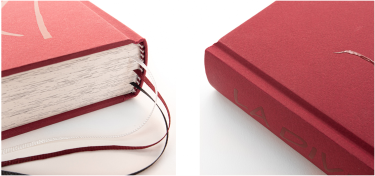
The Anniversary Edition

For this edition I tested hundreds of color pairings, and through various investigations of the best papers available, I and my team chose the colors Paprika, similar to Bordeaux, and Cinnamon, similar to Sienna.
These two colors are reminiscent of the color of the Tuscan land where Dante was born, linking contemporary design to the ancient pigments obtained from Florentine clay. We then chose the colors of the book’s headband – white and burgundy – and bookmarks – white, burgundy and black, for Paradise, Purgatory and Hell.
Using extreme cropping, I like to show just a sliver of the face visible at the edge of a page to bring the viewer right in close to Dante’s perspective. I want the reader to experience the poem from Dante’s eyes.

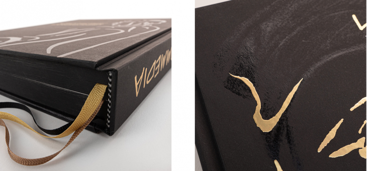
The Collector & Heritage Editions
For these editions, I wanted to give them a contemporary look that was also very elegant – that ‘Designed in Italy’ feel. I thought of the classic gold-on-black pairing, so dear to fashion and design. I thought back to a drawing by George done in charcoal, which had struck me while browsing through his works: the Florentine poet is represented following the physiognomic reconstruction made by anthropologists and engineers of various Italian universities. Behind the poet you can see the city of Florence.

To foreground Dante’s face, and in agreement with the experts at Pazzini Stampatore Editore, I decided that the background drawing on the cover should be made with a glossy varnish on black paper, so that it could be seen more or less intensely according to the different refractions of light as one turns the book.


The edges of the book are painted in black, to complete the contemporary look of the edition. The headband is finished in black and white, and the bookmarks are black for Hell, bronze for Purgatory and gold for Paradise. I further chose a Bodoni binding, in perfect Italian style. Giambattista Bodoni was an Italian typographer, printer and engraver in the mid-1700s, inventor of a famous typeface and the binding that takes his name. Bodoni’s binding and flat book spine also distinguish the most deluxe edition, called the Gold Edition.
The Heritage Edition’s spine and slipcase are made with premium material Skivertex by Fontana Grafica.
You can personalize your copy with your name, your family name, or a dedication to your loved one, and it will be printed with the same golden foil used for Dante’s face on the back cover of the book.

The Gold Edition
For this edition, I decided to rely on expert artisans who would realize by hand what I had in mind. Clara Semprini, our project manager, an architect and skilled decorator, went through several tests on the wood. She first tested it with a pyrograph, then with gold leaf, managing to perfectly interpret my vision through her design. This beautiful edition is characterized by precious black-stained ash wood for the cover; a spine made with Italian leather by Conceria 800, traditionally used for Italian haute couture and tanned in the pit with natural dyes; and it features Dante’s face and title in 24K gold leaf.

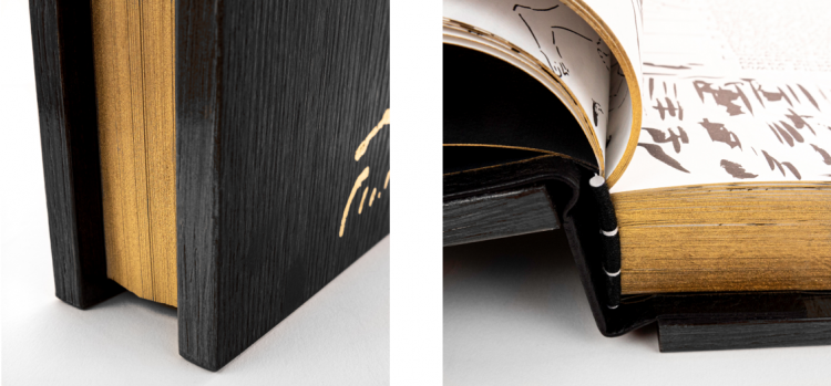
The binding of the body of the book is handmade and hand-sewn by Bottega dei Gozzi in Modena (Italy), who also made the handmade headband in two colors (black and white) and gilded the edges of the book in gold. The edition is accompanied by a rotating plexiglass slipcase, by Italian publisher Roberto Bini. The paper used is of the highest quality, produced by the Italian paper mill Fedrigoni.
The Back Covers
For the back cover of all versions, I used a drawing from George’s Inferno – Dante, turned away from the viewer, seems to be pulling the viewer with his hand to take them with him to visit the underworld. Next to Dante, the first verses of the Divine Comedy.
An Italian-Designed Book
For Your Personal Library
COMING MARCH 16TH!
This vision of beauty and fine craftsmanship will only be made possible by people like you! Our Kickstarter crowdfunding campaign to help us publish this exquisite work will be LAUNCHING ON MARCH 16TH. Stay tuned for more on the exclusive early-bird prices and backer rewards, announced FIRST to anyone on our email list (that’s you!).
Don’t Miss Out!
Interested in the whole story of how “La Divina Commedia – The New Manuscript” came to be?
1. George Meets Dante: The Love Story & The Passion Project
2. A Monk in New York: A Journey Back in Time
3. On The Shoulders of Giants: One Man + 700 Years of Art Inspired by Dante
4. The Commedia & Comics: George Considers the Connections
5. The Artist as Scribe: 350.000 Characters Later…
6. Illustrating the Commedia: Dante’s Color Library
7. Exclusive Book Design Preview: Handcrafted in Italy & Thoughtfully Designed by Giulia Fogliani (you are here)